
As the Android operating system continues to evolve, the days of revolutionary redesigns are clearly behind us. Instead, Android 16 continues Google’s trend of polishing the user experience through subtle — but impactful — tweaks. Here at MbombelaTech, we had the chance to test drive the first beta of Android 16, and what we found is not a feature-packed revolution, but a beautifully expressive update that’s all about how your phone feels and looks. And honestly? We’re here for it.
Let’s break it down.
Material You Evolves into Material 3: Welcome to Expressive Android
Android 16 leans into a visual evolution — and Google’s calling it Material 3 Expressive. It’s brighter, more colorful, and just generally more fun. Instead of radical functional changes, this update builds on Android’s identity as a personal OS — with deeper aesthetic refinements and more fluid physics that make everything feel more lifelike.
It’s like Google decided to give Android a fresh coat of paint and a massage.
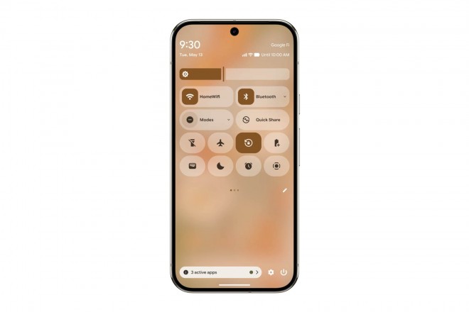
🔓 1. Lock Screen Customization – Familiar, But Better
We unlock our phones a hundred times a day, so it makes sense that Android 16’s lock screen gets some love. The new lock screen picker is more organized and intuitive. You still access it the same way — long press on the lock screen, hit customize — but now the UI is cleaner and smoother.
Here’s what’s new:
- New clock customization: You can now tweak the thickness of your lock screen clock font using a handy slider — go razor-thin or bold and chunky.
- Notification style options: Choose between a full list view or a compact icon view under the clock.
- Quick shortcuts on the left and right corners are easier to assign.
It’s not reinventing the wheel — it’s making it smoother, sleeker, and more you.

🌀 2. New Physics Engine – Subtle But Satisfying
This one’s tough to explain until you feel it, but Android 16 introduces new expressive physics throughout the interface. Menus feel like they have weight. Multitasking windows bounce and tug against one another like they’re suspended in invisible rubber bands. Notifications don’t just slide away — they peel off from the stack.
These changes are subtle but make Android feel more alive — especially paired with the upgraded haptics that deliver soft, accurate vibration feedback as you interact.
🗂️ 3. Better Recent Apps Menu – Functional and Playful
The Recent Apps screen finally gets the attention it deserves. Android 16 adds:
- A drop-down menu on each app card, revealing actions like Split Screen — no more hidden menus.
- Physics-enhanced multitasking: Drag an app card, and nearby cards respond with gentle movement.
- Enhanced haptics: Each scroll and swipe through your open apps feels tactile and responsive.
It’s all about discoverability and interactivity, and Android nails it.
🏠 4. Launcher Tweaks – More Space, More Style
The home screen experience also gets some upgrades:
- The once-obnoxious At-a-Glance widget is finally a bit smaller (still not removable, but we’ll take it).
- New grid sizes let you fit an extra row of icons.
- And best of all? Wallpaper effects.
Here’s where things get creative:
- Shape effects: Overlay a color-matched design element on top of your background.
- Live weather effects: Fog, rain, snow, or even a glowing sun animation plays out on your screen depending on your mood (or real-world conditions).
- Cinematic mode: With the help of AI, static wallpapers get subtle 3D movement — ideal for portraits or dynamic photos.
These don’t boost productivity per se, but they make your phone feel more personal and fun — and that’s a win.
🧠 Final Thoughts: Android 16 Is All About Feel
While Android 16 doesn’t come with headline-grabbing features or game-changing capabilities, it’s a masterclass in user experience design. It’s delightful, responsive, and thoughtfully expressive.
But here’s the catch — most of these updates are currently limited to Google Pixel devices. If you’re not in the Pixel club, you might not see these changes for a while — if ever.
🏁 MbombelaTech Verdict
⭐ Rating: 8.5/10
✅ Pros:
- Beautiful, expressive new UI
- Highly customizable lock screen and launcher
- Improved multitasking menu
- Great use of haptics and animations
❌ Cons:
- Limited to Pixels (for now)
- No major new functionality
- Some visual features feel gimmicky to power users
Android 16 is a soft step forward — but one with polish, charm, and personality. If you’re a Pixel user, this beta is definitely worth trying out.